
Pantone Colour of the Year in Surface Pattern

Attention Pattern Designers… It’s time to look at the Pantone Colour of the Year in Surface Pattern.
Welcome to another issue of Confessions of a Pattern Designer. Are you feeling Peachy?
I will admit, when I was first designing I didn’t think too much about colour, especially the Pantone Colour of the Year, I was very focused on the artwork and elements of a design and the idea of colour was always a secondary thought. If you’re at that stage right now I want you to listen up because when it comes to design, it goes so much deeper than the scattering of motifs on a repeated tile. You know I’m all about design intention… and colour is a part of that. So it’s time to look at the Pantone Colour of the Year in Surface Pattern as well.
As a designer colour is so important to the vision and the outcome. If you haven’t been putting focus on the colour in your designs then you are missing an ingredient that can automatically draw someone to your artwork and design. Remember pattern design is a visual art, and when we view it we are triggered with emotions and feelings… colour in your pattern designs is a big part of that.
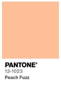
If you haven’t heard already, Pantone has announced their colour of the year and it is “Peach Fuzz”.
So the question is… Pantone Colour of the Year in Surface Pattern, is it important?? Moreover, how can this information benefit you?
Well yes, it is important. When trends come as a designer it is your job to work out how you can weave it into your work so you are capitalising on the hottest thing. If you can incorporate it it will instantly make your work relevant.
After all, who said you can’t use Pantone Colour of the Year in Surface Pattern Designs?
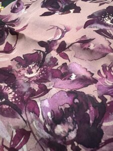
This is a great example of how I have weaved those peachy tones in my designs.
Even if this colour is far from your usual palette and pushes you out of your comfort zone, think about injecting it into your normal palettes. By doing this you will inevitably create work that is new and fresh for you as well. I call that a WIN WIN.
Is it a colour I normally design with… No. But this is pulling on all those aubergine tones that I often play with and I’m loving this new direction.
Romantic | Sophisticated | Safe | Calm
So, Peach Fuzz. What’s it about?
When it comes to colour in a print design it’s about evoking those feelings that we want the customer to feel.
Peach Fuzz is that mix of orange and pink. Coral tones with a lightness to them. These colours evoke warmth, optimism and balance which are feelings we are drawn to as so many are struggling with today’s economic climates.
Do you ever think that deep into your colours in your designs? If not, I have a FREE challenge coming up that’s going to help you target your designs and create emotive storylines in your prints. way deeper than pretty patterns.
How is Panton Colour of the Year affecting us as Surface Pattern designers and the industry?
Calming colours like taupe and beige have been quite prominent in the commercial textiles industry, which has been hard for print designers who adorn their patterns with colour and print.
I’m in Team Ban the Beige! Are you with me?
But we need to design with consumers in mind and these soft safe colours are quite common after uncertain times…. and after all, it wasn’t long ago we came out of a global pandemic.
The great news is there is colour on the horizon. Peach Fuzz is romanticising these safe soft colours and it’s a great way to add colour whilst still appealing to those who are scared to shine!
Am I a fan of Peach Fuzz… not particularly. I’m patiently waiting for the rainbow to come back into play, but enjoying pushing myself to new realms as I experiment with injecting colour and print in clever ways to products.
If you want to sign up to my FREE challenge Floral Seasons in Surface Pattern in kicks off 29th January 2024 you can sign up right here.
