From concept to DELIVERY
Every collection and group of designs go through the same journey to get from concept to delivery.
Keywording, ideal client, trend analysis, competitive market research and collating and refining imagery for moodboards….all before I start creating imagery. This is a really important part of the process to ensure the designs are appealing to the right customer, to make sure they are individual but still commercial.
Below are a few examples of the journey of a pattern, the roadmap of my creative process and how I finally get to my final destination aka. The final print strike off.
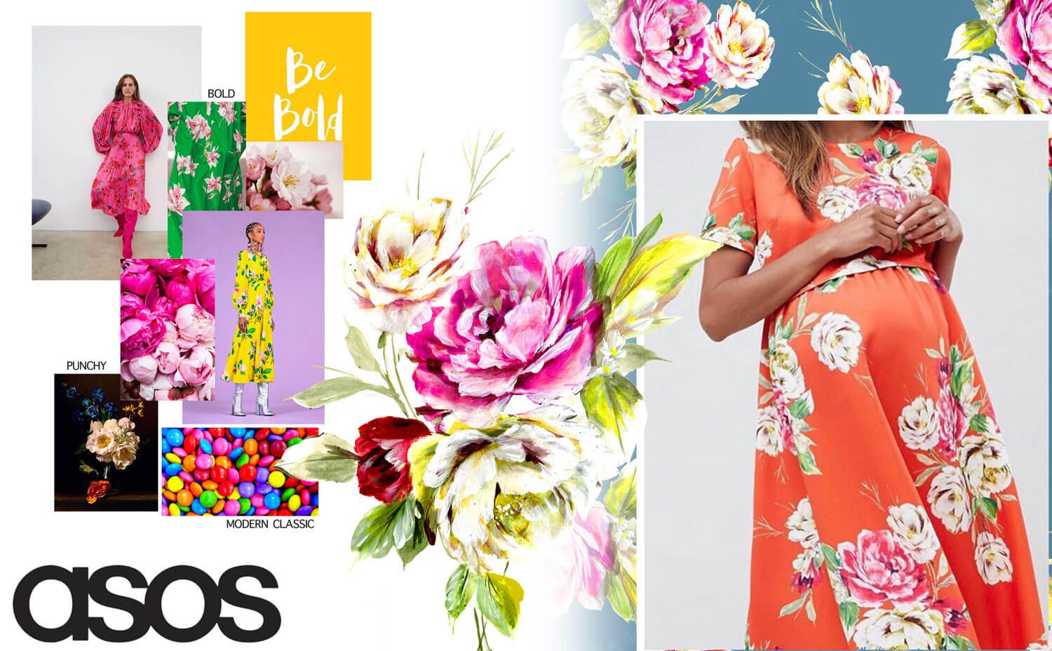
ASOS
Bold and Punchy with a MODERN twist on a Classic look.
This classic floral has all the elements of a traditional floral but with a strong looseness and bright blooms creating a youthful modern edge to a classic look.
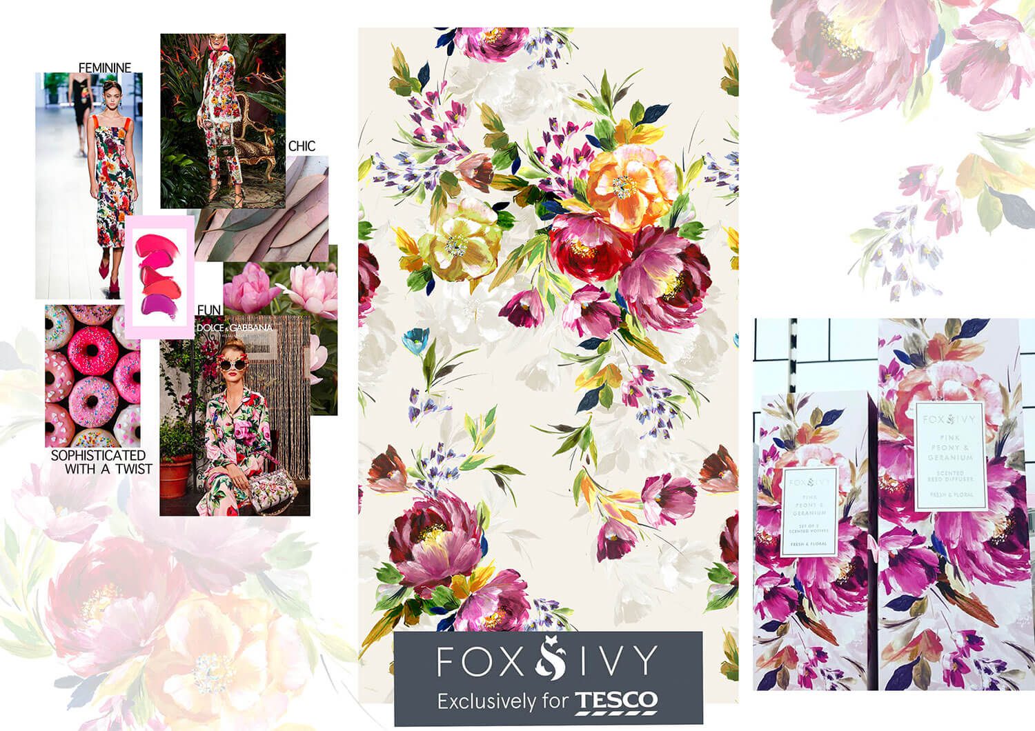
TESCO
Feminine and FUN with a Sophisticated twist.
Lipstick colours are the star of the show bringing those feminine colours to life with fun magentas and hot pinks. Multi-level design allows the vibrant blooms to sink into the ground for a sophisticated look.
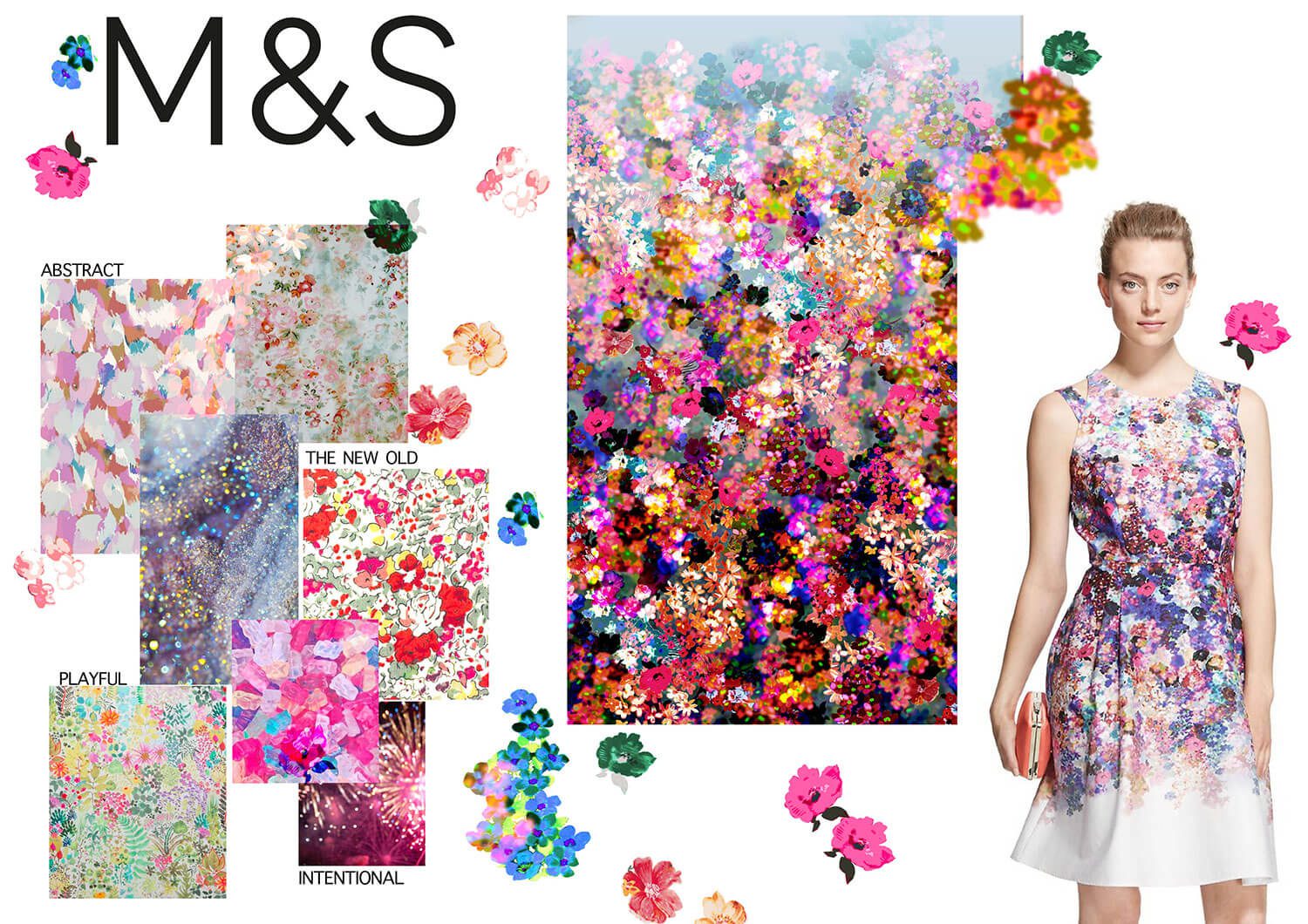
M&S
Abstract but Intentional DITSY with a Playful take on the old.
A combination of digital and hand painted florals creates a 'of the minute' trend focussed commercial ditsy, whilst adding timeless elements to appeal to the M&S customer.
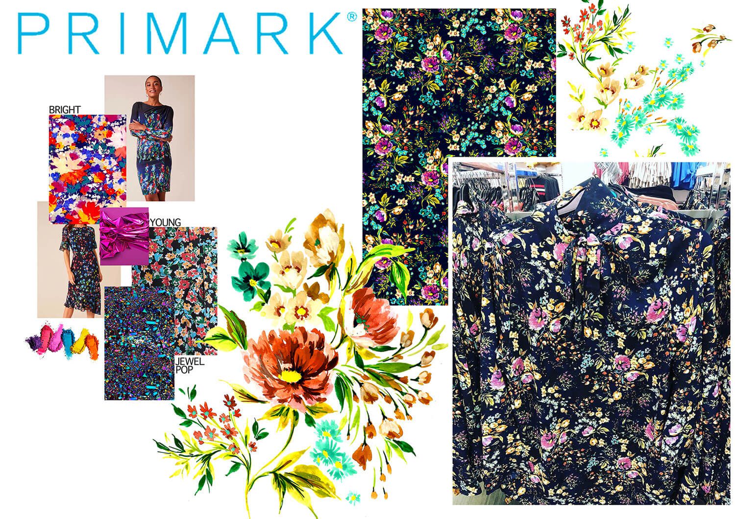
PRIMARK
Bright and Young
Bright on dark grounds create the perfect contrast to this youthful market. Floral sprays with vintage nods combined with bright jewel tones bring a more polished look to this younger market.
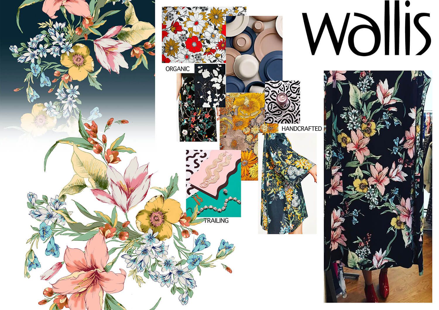
WALLIS
Organic, TRAILING and Handcrafted
Pen and ink illustrations gives a nod to the traditional printmaking techniques, whilst organic colourways and chalky tones continue to set the scene. A modern trailing composition on a contrasting ground breathes new life into this vintage inspired pattern, appealing to the modern woman.
